Color experts predict a bold shift in color choices as people become more daring and expressive. The days of neutrals and cool tones are over, and warmer, vibrant hues are set to reign in 2023. Laurie Pressman of the Pantone Color Institute explains that people are not just gravitating towards bolder colors but using them in creative ways to enhance their living spaces.
A Personal Touch with Vibrant Palettes
Gone are the days of playing it safe with white walls and neutral decor. People now feel more confident about experimenting with vibrant hues and mixing color stories to create personalized living spaces. According to Andrea Magno, color marketing director at Benjamin Moore, embracing color is an excellent way to refresh one's home and experience the transformative power of bold hues.
The Six Color Trends of 2023
While personal preference ultimately drives color choices, color experts Pressman and Magno have identified six color families that are set to dominate in 2023. These trending colors promise to add vibrancy, depth, and character to any living space.
Vibrant Reds and Oranges Take Center Stage
In a bold move away from the muted tones of previous years, Benjamin Moore has selected "Raspberry Blush" as their color of the year. This choice reflects a larger trend in the interior design industry towards more vibrant and saturated hues.
According to Magno, "2023 will showcase bold, unexpected color choices that push beyond the neutral and muted shades of recent years." By highlighting a color that encourages creativity and self-expression, Benjamin Moore hopes to inspire more adventurous design choices.
Experts predict that colors within the red, orange, and terracotta families will become increasingly popular for their ability to inspire people to step out of their comfort zones and embrace more vibrant hues. Pressman agrees, stating that "the vivid and energizing tones of red and orange are sure to lift our spirits."
Captivating Magenta
Even though it's a member of the red family, magenta steals the show with its lively personality that is sure to capture attention in the upcoming year. In 2023, the Pantone Color Institute has selected Viva Magenta as its official color of the year due to its cheerful and powerful nature. This red with hints of purple is an excellent match for a variety of color palettes, ranging from richer jewel tones to lighter, earthier hues.With virtual reality becoming increasingly prevalent in our daily lives, Pantone believes that a shade like Viva Magenta can flourish in both physical and digital worlds, inspiring exploration along the way.
In addition, shades of fuchsia will be making more appearances this year. KitchenAid has declared Hibiscus as their color of the year, commemorating the lively pink that celebrates lavishness and free-spirited journeys.
Unexpected Greens
Mid-tone greens have been invading homes worldwide due to their ability to evoke a natural ambiance. While this soothing hue has established itself as a popular neutral, Magno predicts that unusual shades of green, such as Savannah Green featured in their Color Trends 2023 palette, will soon make their way into homes.
"Savannah Green is an excellent example because of its citrusy, acidic quality that may seem unexpected as a wall color, but when used in a room, it exudes a playful yet sophisticated vibe," notes Magno.
Though it may seem daunting to coat your walls in electric chartreuse or forest green, the outcome is sure to leave you astounded and inspired.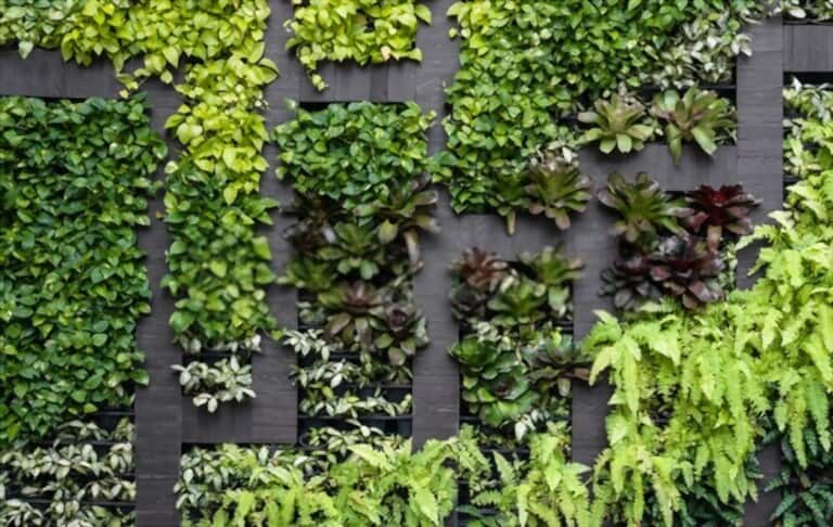
Crafty Tones
Pressman notes that there is a growing interest in 'earthbound natural shades' in 2023 that are reminiscent of different types of woods, minerals, and even jewels. C2 Paint's Tiramisu, a midtone brown with coppery hues, aligns perfectly with this trend and is the company's color of the year. This move towards organic tones provides a nuanced backdrop for comfort and stability.
Warm Neutrals
For color experts, neutrals play a vital role in establishing a solid base. Instead of cooler tones, today's neutrals embrace a warmer disposition with earthy undertones. Sherwin-Williams, for instance, chose Redend Point, a mauve-y shade, as their color of the year. In the upcoming year, we can anticipate various shades of blush popping up.
Shades of Depth
Black is indeed timeless, but a room can also have depth and elegance with a variety of other shades. As part of their Color Trends Forecast, Benjamin Moore recommends Wenge, a deep chocolate color with hints of violet and black, instead of black. According to Pressman, earthbound violet tones are becoming more popular, and shades of brown, purple, and green offer drama and strength but with an unexpected and layered feel.


